Do you like my art?
    buymyart
Search

Archive for the ‘Tutorials/Steps’ Category

How I create, step by step

2014creation-for-thatsjustsocute1l

I´ve been asked if I will join Thats Just So Cute as a guest designer in February, and of course I will! So fun! I´ve made this card after my choice of challenge theme: My sketch, shabby chic and at lace.

The hot air ballons is chipboard, and they comes from Scrapiniec.
I combine this challenge post with my dt post for Scrapiniec.

2014-02-05 20.50.41

This is the sketch, and it´s ok to turn it on what way you want, but it will be clear that you´ve used the sketch. Jump over to Thats Just So Cute and join the challenge! I will put toghether the prize for the winner!

2014creation-for-thatsjustsocute1a

This is how I create.
First I choose things I want on my card.
Here is both decorations, motives and papers.
I NEVER glue anything before I´ve put it
together at the card, and I´m satisfied with
the places for everything. I can sit for an
hour and move around things before I´m
totally satisfied.

2014creation-for-thatsjustsocute1b

This is my favorite tools.

2014creation-for-thatsjustsocute1c

This is my favorite medium; gesso, white crackle paint, fran-tage embossing, glossy accent, stickles Star Dust, chalk, sparklers (like stickles but thinner – you have to use a brush) and distress paint.
I´m not use everything on every creation, but almost.

2014creation-for-thatsjustsocute1d

First I roll around every paper like this.
Or use a sewing machine.

2014creation-for-thatsjustsocute1e

Then I put on some chalk…

2014creation-for-thatsjustsocute1f

…or distress paint… or gesso… it´s different from time to time.

2014creation-for-thatsjustsocute1g

And then I distresss the edges with an edge scraper. It´s easier to do that AFTER chalk, because the chalk make the paper a little bit wet, and I prefer that. AND the chalk will be alive a little bit longer.

2014creation-for-thatsjustsocute1h

When I´m totally satisfied with how I want everything to
be on my creation, I glue it.

2014creation-for-thatsjustsocute1i

Then I use a brush and paint white gesso at flowers, papers, corners, charms and other things. Just to make it shabby. I prefer it that way. It looks a little bit more alive then. After gesso I use crackle paint here and there so it got crackled and looks old.

2014creation-for-thatsjustsocute1j

I use stickles, star dust is my favorite, at flowers and some details.

2014creation-for-thatsjustsocute1k

I love to use glossy accent on details. If it´s a colored motive I use it on shoes, eyes, lips somtimes, buttons and other small details. I love the effect it will make to the whole creation. Here I have used it at the text. It´s stickers and i like it to be a little bit glossy to pop.

2014creation-for-thatsjustsocute1m

When the creation has dried it looks like this!

2014creation-for-thatsjustsocute1n

2014creation-for-thatsjustsocute1p

2014creation-for-thatsjustsocute1o

2014creation-for-thatsjustsocute1q

4 people like this post.

61 lovely visitors made me happy with comments, thanks! »


How I make my frame around the photos

I use Photoshop, and have made a “frame-picture” as I always use on my photos.
I took a transparent picture in 450×450 pxl (thats my width size, always) and
on that transparent picture I build up how I want my frame to look like by
choosing colors, butterflies, text and so.

When I’m done I save it as psd so I can change something if I want, without make a totally new one. And as I want every layers to be one layer with transparent background, I save it as png. Then I just grab the frame from the png-picture and move it over to my photo. Tadaaa!

When my photos have more height than 450 pxl I just put the frame at the bottom, mark the top of the frame and delete it. Grab the png-frame and move it again, put it at the top of my photo, and cut away the bottom.

It’s not so handsome if you change the size of the frame. I never do that. Hope you’ll understand, or feel free to ask!

MiloLiljaScrapRamar

I have more than one frame to choose from, and I simply moved my png-layers to the same picture, save it as psd and just grab the one I need. I´ve made the background of the picture “red” just so I will see my layers well.

Be the first to like.

1 lovely visitor made me happy with a comment, thanks! »


Witch card with handmade flowers

2013alster257a

This is an inspiration card for Scrapbutiken.
Stamp: Inkadinkado

witches

The whole set of witches from Inkadinkado is amazing.

2013alster257b

2013alster257c

2013alster257d

2013alster257e

I have made the small orange flowers ​​myself.
First I cut out a circle, any size, but I usually use a diameter of 3-5 cm.
Then you cut inward like a spiral. The width of the spirals depends on how high
the flower will be. When you spin them, roll the paper all the way to the middle.
I put lots of glue in the bottom and press the spirals to it.

2013alster257f

Very simple and pretty flowers in right colors for your project. You can decorate them with a pearl in the middle, stickles, chalk and/or crackle paint at the edges.

1 person likes this post.

1 lovely visitor made me happy with a comment, thanks! »


Make a rose

makearose8

makearose1

makearose2

makearose4

makearose5

makearose3

makearose6

makearose7

Be the first to like.

4 lovely visitors made me happy with comments, thanks! »


Technique: Masking stamps

The stamps I´ve used comes from Bombshell Stamps.

Put a bit of tape at the details you don´t want to be stamped.
Fill the stamp with color.

Take away the tape, and tadaa!
You can stamp without the detail.

When masking, you stamp the motive at
two papers, and cut one out.
Place the mask over the image that you should use.

Stamp with some other stamp, that you want
to be a part of your image.

Take away the mask, and you´ve masked!

1 person likes this post.

1 lovely visitor made me happy with a comment, thanks! »


Snowflakes tutorial

I will show you how wasy it is to
make different very simple snowflakes.

On this one I have only used Stickles.
There are lots of colors of Stickles,
and my two favorites is Frosty Lace
and Star Dust.

I stamp on the snowflake with a svirly stamp,
and embossed it with silver embossing powder.

If you want the snowflake to look vintage,
use chalk around the edges.


And finally, this is my favorite;
paint it with crackle paint.

There are lots of more techniques,
ánd this ones are very very simple.

Be the first to like.

2 lovely visitors made me happy with comments, thanks! »


Two different ways to stamp

I will show you two ways to stamp the motive.
One with “Black Versa Fine”, and one with “Pumice Stone –
distress”.

I only used this distress markers at this motive.

I really love the soft look at the left confirmand.
What YOU think is the nicest?

Look at theese cute confirmands from Bildmålarna!

The best paper to paint on, with the distress markers.
It costs about 90 skr at Clas Ohlson.

Be the first to like.

3 lovely visitors made me happy with comments, thanks! »


Colouring with Distress Markers

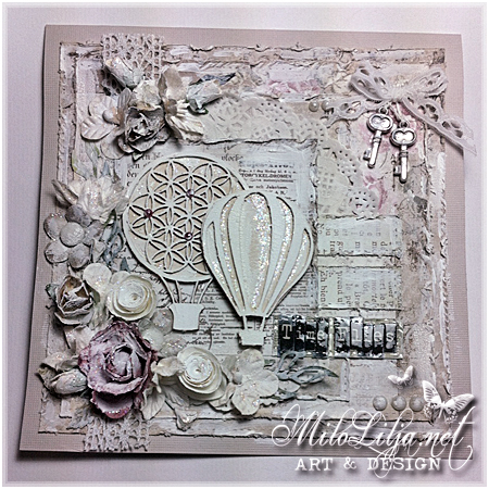
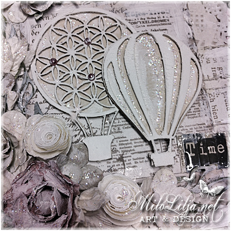
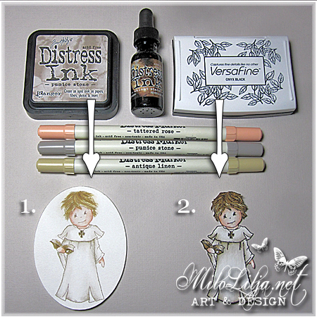
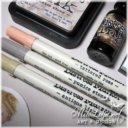
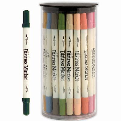
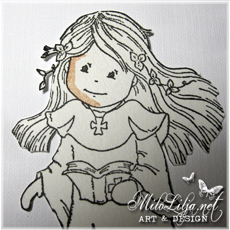
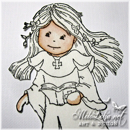
I really looooove the Distress Markers!
Here I will show you, and explain in both EngliThis is how I’m
colouring with the great Distress Markers.

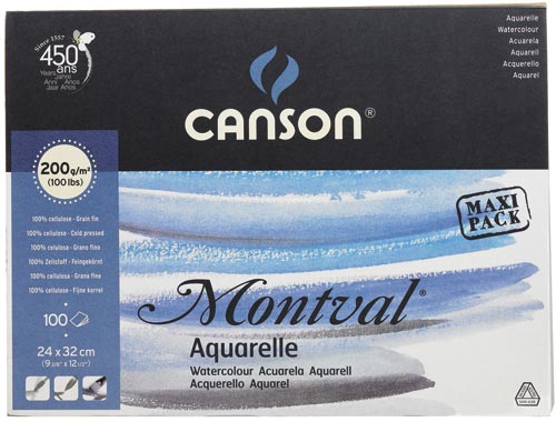
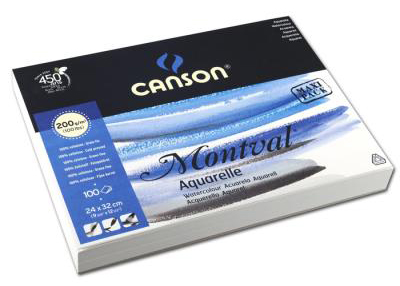
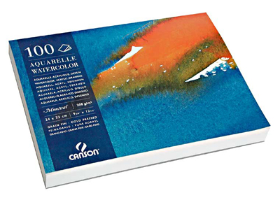
I use this aquarelle papers. In Sweden you can bye them at Clas Ohlsson,
40 papers for 89 skr.

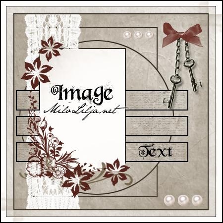
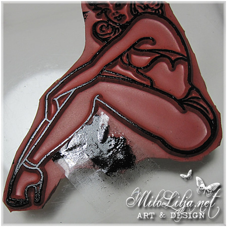
Först målar jag ett tjockt streck nära kanten av
fältet jag vill färglägga med en Distress Marker.
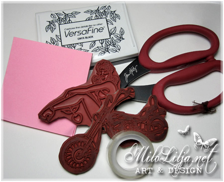
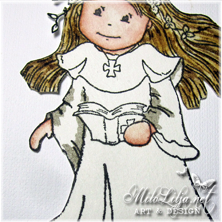
Färgen jag använder som hudfärg heter “Tattered Rose”.

Stämpel: Bildmålarna.

First, I paint a thick line near the edge of the
field I want to paint with Distress Marker.
The color I use that body color is called “Tattered Rose”.

Stamp: Bildmålarna.

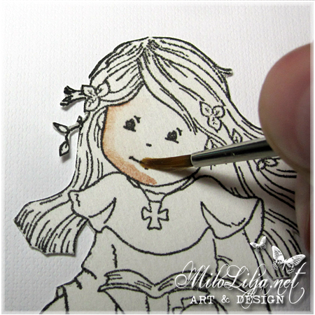
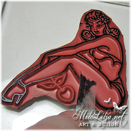
Sen tar jag snabbt, innan färgen torkar in, en vanlig pensel
och “suddar ut” färgen mot mitten av fältet som ska målas.
Jag suddar såpass mycket så det inte blir något skarpt streck.

Penselspetsen har jag doppat i vatten, och sedan strukit av
mot ett kaffefilter så den inte är för våt.
Att sudda på det här sättet fungerar INTE för mig om
penseln är för våt, då färgen flyter ut och pappret protesterar
genom att bli lite “ruggat”. Är det för vått så fungerar
det inte att måla med Distress Marker. Jag rekommenderar
därför en vanlig pensel och INTE en vattenpensel.

Then I quickly take, before the paint dries up, a regular brush
and “blurs” the paint to the center of the field to be painted.
I blurs enough so there will be no sharp line.

The brush tip dipped in water, and then deleting mostly of
the water against a coffee filter so it is not too wet.
To blur in this way does NOT work for me if
the brush is too wet, as the color flows out and the paper protests
by becoming a little “rugged.” If it´s too wet it´s not work
painting with Distress Marker. I recommend
therefore a regular brush and NOT a water brush.

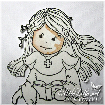
För att fylla hela ansiktet med färg, så målar jag ett
tjockt streck även i andra kanten på fältet.

To fill the face with color, I’ll paint a
thick line in the other edge of the field.

För att få lite mer skuggeffekt, så fyller jag på med Distress Marker
i kanterna och på kinderna, under förutsättning att det inte använts för
mycket vatten. Men detta lager skuggar jag inte ut lika mycket mot mitten
eftersom jag vill ha effekten att det är mörkare ut mot kanterna.

To get a little more shading, I fill the edges and on the cheeks
with Distress Marker, provided that I not used too much
water. But at this layer I want the shadow to stay away from the middle
because I want to have the effect that it is darker towards the edges.

Även dessa strecken “suddas ut” med hjälp av penseln, som vattnet
är avstruket från. Gör på samma sätt med händerna, på med Distress
Marker i kanten, och sen sudda ut mot resten av fältet med pensel.
Fyll eventuellt på med lite mer färg i kanten om du vill ha mörkare
skugga. Du känner själv hur mörk skugga du vill ha.

I will “blur” even these lines by using the brush with very little water.
Do at the same way with the hands, with Distress Marker at the edge,
and then blur out to the rest of the field with the brush.
Add some more color on the edge if you want darker
shadow. You know yourself how dark shade you want.

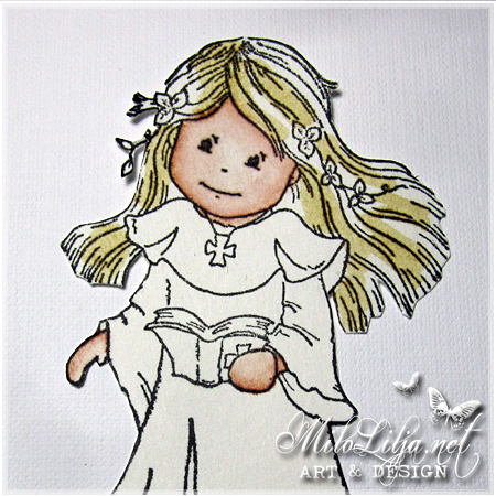
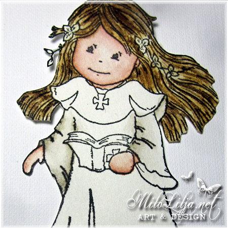
I håret har jag dragit streck med en Distress Marker.
Jag har lagt strecken lite oregelbundet, och tanken är att den här
färgen ska bli en grund för en mörkare av två nyanser.
Färgen heter “Antique Linen”.

In the hair, I have drawn lines with a Distress Marker.
I added the lines a little irregular, and this color
should be a basis for a darker shade.
The color is called “Antique Linen”.

Med penseln har jag sedan på samma sätt som med huden,
suddat ut färgen till den omålade ytan av håret, så det blir
en ljusare nyans där.

I used the brush in the same way as at the skin, blurred
the color of the unpainted surface of the hair, so it
becomes a lighter shade there.

Här har jag fyllt i med penselstreck av färgen “Walnut Stain”, men
från refillflaskans färg. Jag tycker att Distress Marker-färgen “Walnut Stain”
har en liten grön ton i sig, och därför föredrar jag att använda refillflaskan
när det gäller just den färgen.

I’ve filled out the brushstrokes with the color “Walnut Stain”, but
from the refill bottle. I think Distress Marker color “Walnut Stain”
has a slight green hue in itself, and therefore I prefer to use refill bottle
when it comes to that color.

Den mörkare hårfärgen suddar jag ut mot den lite ljusare ytan.
För att få ännu mer “slingtoning” på håret så kan man med fördel
lägga i lite fler ännu mörkare slingor här och var, gärna i “underhåret”.

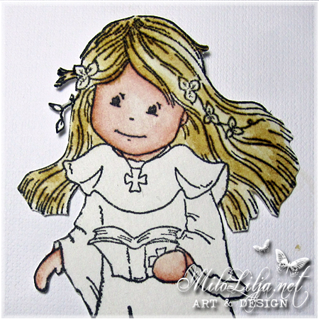
Ärmarna har jag målat streck i kanterna på med Distress
Marker “Pumice Stone”.

The darker hair color blurs out to the little brighter surface.
For even more “loop gradient” of the hair, you can advantageous
add a little more even darker loops here and there.

At the sleeves I have painted lines in the edges with Distress
Marker “Pumice Stone”.

Här ser ni hur jag har suddat ut färgen på ärmarna mot mitten av ytan.
Beroende på hur ljus eller mörk man vill ha ytan, desto mer färg lägger
man, men var noga med att bara lägga i kanterna, annars försvinner
gärna “skuggeffekten”.

Here is how I have blurred the color of the sleeves to the mid-surface.
Depending on how light or dark you want the surface, the more color you
will add, but was careful to add only the edges, otherwise the “shadow effect”
will disappear.

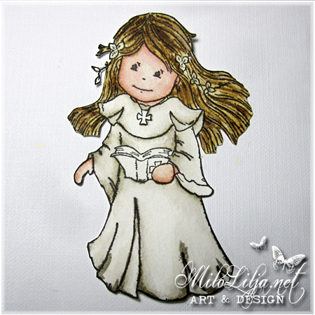
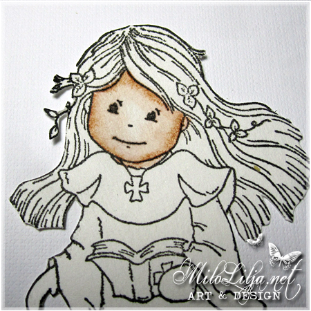
Just den här klänningen vill jag ha ganska “vit”, och då tycker jag att
just “Pumice Stone” är en bra färg att skugga med.
Självklart är det en smaksak, en del skuggar med en beige nyans
och en del vill ha det vita fältet ännu mer vitt.

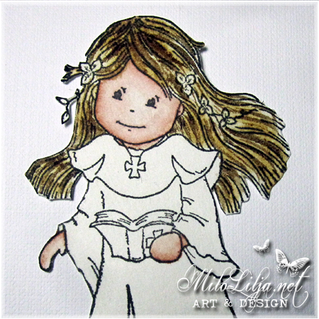
Här har jag lagt i färg i kjolen. Ni ser att det är ganska lite färg,
det är för att annars blir hela klänningen mer grå än vit, eftersom jag
suddar färgen så det inte ska bli några kanter alls kvar.
Det sista in mot mitten suddar jag endast med lite lite vatten, för
att tona ihop strecken med det som ska vara vitt.

This particular dress, I would have rather “white”, and then I think
just “Pumice Stone” is a great color to make shades with.
Obviously, it is a matter of choice, some will do shades with a beige hue
and some want the white field even more white.

At this picture I have put the color at her dress. You see,
there are just very little color, it is because otherwise the
whole dress will be more gray than white, because I
blurs the color so it will not be any edges left at all.
At the blurring into the center, I just use a little bit of water.
I want the lines to diseapper out at the white area.

Skuggor ligger under boken, under ärmarna, och i klänningsvecken.

There are shadows under the book, under the sleeves och at the dress folds.

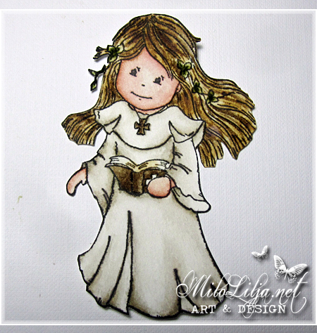
Halsbandet och bibeln har jag målat med Distress refill “Walnut Stain”.
Bladen i bibeln har jag haft lite lite Distress Marker “Antique Linen” på och suddat.

Löven i håret har jag målat med en prick av Distress Marker “Peeled Paint”,
och sedan suddat ut med pensel på samma sätt som resten av färgerna.

Fråga gärna om du undrar över något.

The necklace and the Bible, I have painted with Distress refill “Walnut Stain”.
At the pages of the Bible, I have had a little bit Distress Marker “Antique Linen”.

The leaves in her hair, are painted with a dot of Distress Marker “Peeled Paint”
and then blurred by brush in the same way as the rest of the colors.

Please ask if you have any questions.

Paint with Distress Ink.
Color map for Distress colors/Markers.

1 person likes this post.

11 lovely visitors made me happy with comments, thanks! »


Gesso

Scroll down for English.

Gesso är en blandning av puts eller kalk och limvatten, ibland även andra ämnen och används vanligen i samband med tempera eller olja. Gesso kan även modelleras i relief. Numera använder de flesta akrylbaserad gesso. Syftet med gesso är att hindra den oljebaserade färgen att “fräta” sönder underlaget.

Det är smidigt att grundmåla med gesso innan man använder sig av tex. Distress Crackle Paint. Jag upplever att crackle paint gärna vill lossna på en del underlag. Eftersom gesso ger det en slät, absorberande, vit grund så gör det att annan färg fastnar bättre.

Jag grundar alltid med ett tunt lager gesso innan jag målar med annat, och jag får ett hållbart snyggt resultat. Du kan även grunda med gesso innan du använder olika spraymister.

Gesso används ibland som gips, det vita mineralpulver som blandas med vatten till en massa, vilken stelnar till fast form och används av skulptörer för formar och avgjutningar.

In English

Gesso is a mixture of plaster or lime and glue/water, sometimes also other substances and is usually used in connection with tempera, or oil. Gesso can also be modeled in relief. Nowadays most people use acrylic gesso. The gesso is to prevent the oil-based ink to “cause corrosion” break the substrate.

It is handy to painting with gesso before the use of Distress Crackle Paint. I feel that crackle paint will fell off from some surfaces. Since gesso gives a smooth, absorbent, white surface, it makes another color sticks better.

I always use a thin layer of gesso before painting with another, and I get a durable-looking results. You can also base with gesso before using different spray mists.

Gesso sometimes used as plaster, the white mineral powder which is mixed with water to a pulp, which solidifies into a solid form and used by sculptors of molds and molds.

Be the first to like.

3 lovely visitors made me happy with comments, thanks! »


Aquarelle papers

For English, please scroll down.

Jag stämplar alla mina motiv på akvarellpapper innan jag målar dem med
Distressmarkers. Det finns en hel uppsjö med olika akvarellpapper, men
jag tänker billigt när jag handlar. Jag använder ganska mycket papper,
och då vill jag inte lägga ut en hel förmögenhet på detta.

Jag vill dessutom ha ett akvarellpapper med fin gräng, så jag kan stämpla
med alla motiv, utan att linjerna blir suddiga pga för mycket gräng.

I stamp all my motives on a aquarelle paper before I paint them with
Distressmarkers. There are quite a lot of different aquarelle papers,
but I think “cheap” when I shop. I use a lot of paper, and then I wount
spend a fortune on this.

I also want a aquarelle paper with a fine grain, so I can stamp
with all kinds of stamps, without the lines beeing blurry because
of too much grain.

Akryl & Akvarellblock, 200 g syrafritt papper.
Acrylic & aquarelle block, 200 g acid free paper.

Montval Akvarellblock 200 g syrafritt papper.
Montval aquarelle block, 200 g acid free paper.

In Sweden you can bye them at Clas Ohlsson, 40 papers for 89 skr.

Dessa akvarellpapper med fin gräng är av hög kvalitet, och passar
dem som vill ha ett mer ekonomiskt akvarellpapper med ett hållbart
resultat. Pappren är syrafria; innehåller inga blektillsatser och gulnar
inte med tiden. Papperen är lättarbetade och klarar stora mängder
vatten och korrigeringar. Passar för akvarell, gouache, akryl-
laveringar och tuschmålning.

GRÄNG = Ett underlags (duk, papper etc) ytstruktur.

GOUACHE = Målning med vattenfärg som har tillsatts ett
vitt pigment och därför i motsats till akvarellfärg ger en heltäckande,
intensiv och matt färgyta. Tekniken för gouache är snarlik akvarellens,
men här finns andra möjligheter att arbeta med tjockare färglager.
Dock ej alltför tjockt då gouachen kan spricka.

Gouachefärg tillverkas på samma sätt som akvarellfärger (gummi arabicum)
men med tillsats av glycerin och något opakt fyllmedel. Som spädningsmedel
används vatten. Den stora andelen pigment gör att gouachen är lösningsbar
även sedan den torkat.

IN ENGLISH

These aquarelle paper with a fine grain is of high quality, and fits
those who want a more economical aquarelle papers with a sustainable
results. The papers are acid free, contain no additives and pale yellow
not with time. The papers are easy to machine and can handle large amounts
of water, and corrections.

GRAIN = An underlay (canvas, paper, etc.) surface structure.

GOUACHE = Painting with watercolor, which has added a
white pigment, and therefore, unlike watercolors provide a comprehensive,
intensive and matte coating. The technique is similar to gouache watercolors,
but there are other opportunities to work with thicker layers of paint.
But not too thick when gouache can crack.

Gouache color produced in the same manner as water colors (gum arabic),
but with the addition of glycerin and an opaque filler. As the solvent
is water. The high proportion of pigment makes the gouache can be disolved
even after it dries.

Be the first to like.

Related Posts Plugin for WordPress, Blogger...

9 lovely visitors made me happy with comments, thanks! »


Milo Lilja
    Swedish - 48 y.o.
    Mom to 2 adults.
    Love cats
    NEED to create.

    Read more


Don´t miss!


Follow me at...
Visitors
    I started this
    blog in September
    06nd 2011.
    d visited me.